
[Fig 1.1]
The outcome of our design efforts for Tasseled 2.0.
In 2020, I lead design efforts to reimagine Tasseled, a planning tool for high school seniors seeking affordable pathways to college. This initiative included a rebrand and a comprehensive redesign of the user experience, strategically focused on boosting adoption and clearly guiding students through money-saving transfer plans.
In early 2021 the Tasseled MVP pilot launched in New York State and introduced a reimagined tool for affordable college planning, generating excitement and a waitlist. Early user research validated the strong need for a solution addressing college costs and debt, with positive responses to the clear guidance and potential savings offered by Tasseled's strategic transfer pathways.
Tasseled (fka "JustTransfer") is a free web-based planning tool designed to help high school seniors save money on their college degree. Its algorithm compares college transfer tables to suggest general education courses at local community colleges, allowing students to build semester-by-semester plans for affordable degree pathways. By strategically using community college credits, students can transfer to 4-year schools with potential savings of up to 40% on their overall degree cost.
As the Principal Product Designer for Tasseled, I engaged in a wide range of activities with the founding team, from strategic workshops and brand development to leading cross-functional collaboration with Content, UXR, and Marketing. While my contributions were broad, this case study will specifically highlight my leadership and execution of the comprehensive redesign of the core Tasseled product experience aimed at improving user adoption and guiding students towards affordable college pathways.
The primary target audience is U.S.-based high school seniors planning to attend college and concerned about the cost of higher education and potential student loan debt. A secondary audience includes parents and guidance counselors seeking resources to help students navigate affordable college pathways.
As a Principal Product Designer, I played a leading role in reimagining the Tasseled product. My contributions included:
The core challenge was to address the increasing financial burden of college and the lack of informed decision-making surrounding student loan debt. High school seniors often do not think to "shop around" for more affordable options, which in turn reduces the incentive for schools to offer competitive pricing. This lack of price transparency and common consumer behavior contributes significantly to the inflating cost of higher education, placing an unprecedented financial strain on young adults.
We also faced a significant negative social stigma about attending community colleges. The social perception, though totally unfounded, prevents many students and families from seriously considering more cost-effective routes to the same 4-year degrees. Because community college doesn't feel like a valid option, students unnecessarily limit their choices and face more debt, highlighting the need to destigmatize this cheaper pathway to higher education.

[Fig 1.2]
The orginal "JustTransfer" brand and web app experience.
The Tasseled project was undertaken with several key constraints that shaped our approach and initial scope:
We began by interviewing the founding team to understand the product's history, challenges, and vision. Product workshops were conducted to define the company's mission, vision, and Northstar statement, ensuring internal alignment on the product's future direction and value proposition. We also audited the existing "JustTransfer" product to identify usability issues, noting its outdated UX, visual clutter, and lack of mobile-friendliness.

[Fig 1.3]
Synthesis of our stakeholder interview with Vipul.

[Fig 1.4]
Synthesis of our stakeholder interview with Nelson.
We created a detailed journey map to document prospective college students' experiences, identifying key milestones, pain points, and opportunities. Using the "How Might We" framework, we hypothesized solutions and organized them into themes using affinity mapping. These themes were then prioritized into a feature roadmap based on criticality, effort, and feasibility.

[Fig 1.5]
An overview of the outcomes from our journey mapping workshop.

[Fig 1.6]
"How Might We" statement examples from our journey mapping workshop.
We conducted user tests with a small group of U.S.-based high school seniors to understand their college planning process, needs, and pain points. The research validated the need for a cost-saving tool like Tasseled, highlighted concerns about student loan debt and community college stigmas, and provided valuable insights into user expectations and understanding of the prototype. Key recommendations included positioning Tasseled around debt avoidance and providing more information about community colleges.
[Fig 1.7]
The prototype that we tested with High School seniors.
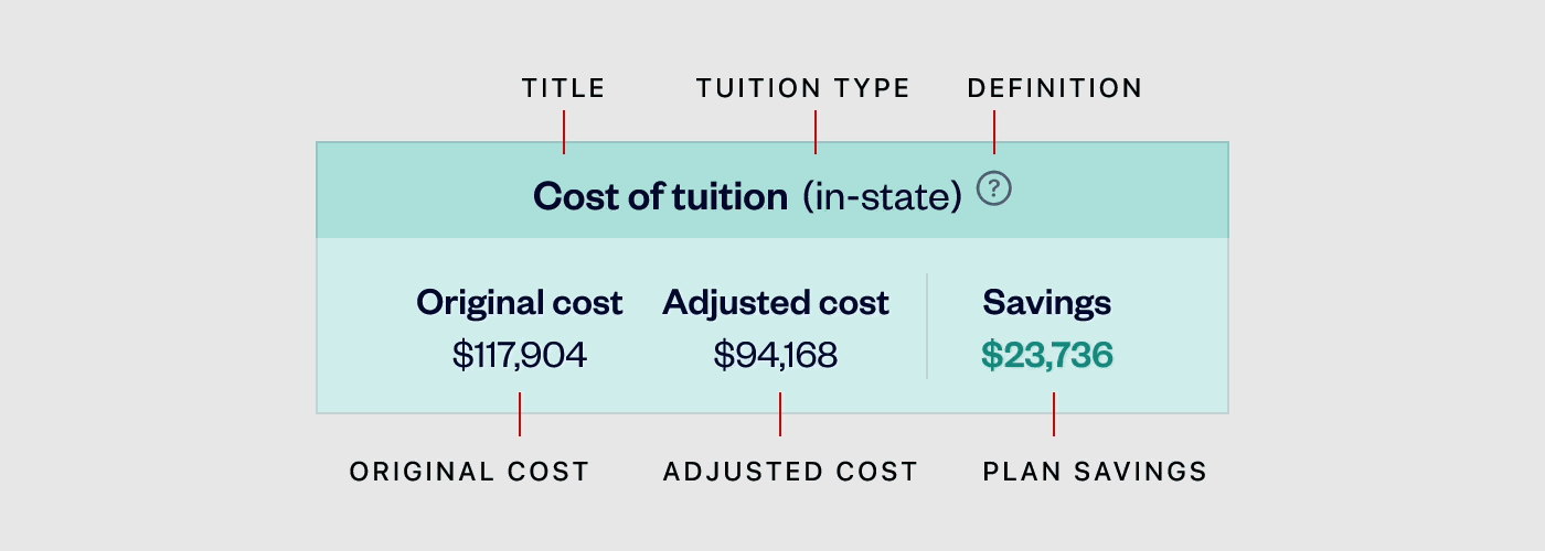
Based on user research insights, I led the redesign of the user flow, aiming to improve navigation and reduce friction. The initial Kanban-style dashboard from the UXR prototype was replaced with more conventional UI patterns like pages, cards, and action sheets to enhance intuitiveness and mobile-friendliness. Key areas of focus included the "Degree Cost Calculator," where thoughtful language and visual hierarchy were employed to maximize clarity and emphasize potential savings. The design process involved iterative experimentation and collaboration with content design.

[Fig 1.8]
An example of part of our architecture work.
[Fig 1.9]
The structural evolutions of the "Degree Cost Estimator"

[Fig 1.10]
A wire flow showing how the user journey from dashboard to the granular details of the Degree Cost Estimator.
The initial plan for a nationwide MVP launch was strategically pivoted to a pilot launch in New York State in January 2022. This allowed for focused data collection and ensured comprehensive coverage of transfer tables for the initial user base. Alongside product development, the marketing website was redesigned to reflect the rebranding efforts and generate interest ahead of the pilot launch, including targeted notifications for students in New York State.
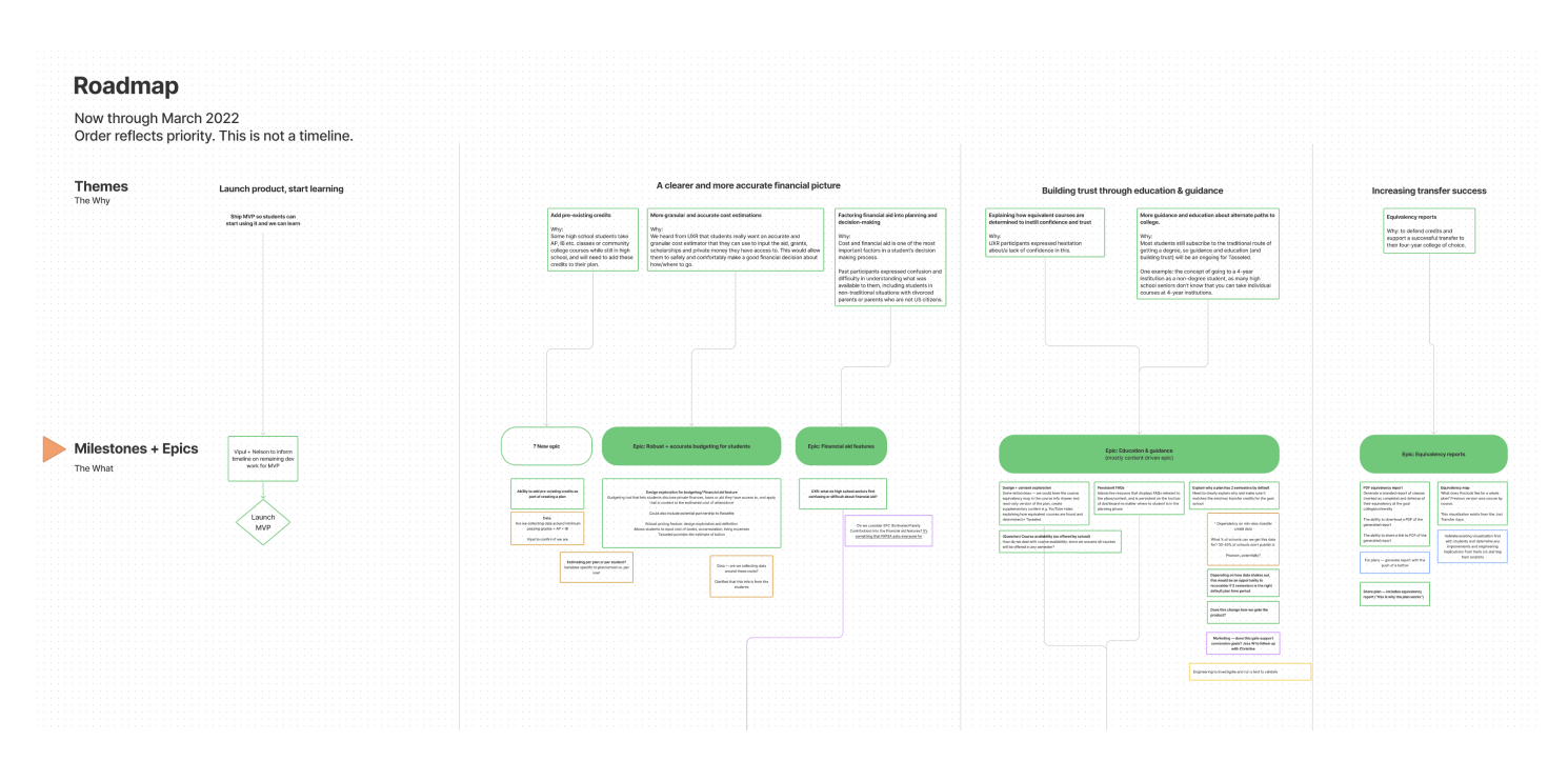
[Fig 1.11]
A snippet of our Roadmap, outlining MVP feature priorities and identified "fast follows."
Following the MVP pilot launch in New York State in early 2022, my direct involvement with the Tasseled founding team concluded. Review of the initial performance metrics and user feedback in 2024 revealed that the pilot launch did not achieve the anticipated user engagement. A significant bottleneck was identified in the onboarding process, where users struggled to complete the initial questions required to generate a transfer plan. Notably, the data indicated that not a single user successfully navigated through these initial inquiries to the point of creating a personalized plan.

[Fig 1.12]
The current state of the Tasseled tool.
This outcome highlighted a crucial learning: the MVP's initial onboarding flow inadvertently created a barrier for our target audience. Unlike the more exploratory approach of the original "JustTransfer" tool, the MVP's immediate requirement for specific majors and target universities ("What are you studying?", "Where do you want to go?") proved to be significant hurdles for many 17 and 18-year-olds still exploring their options. The data strongly suggested that users felt they needed definitive answers before they could even begin to see the value of Tasseled.
Post MVP pilot, the Tasseled founding team responded to this feedback by astutely pivoting back to a previous design pattern that allowed for a more flexible, "Mad Libs"-style input of minimal information. Going back to this pattern enabled students to do some initial exploration without the pressure of knowing exactly what they wanted to do (after all, they were coming to Tasseled to figure that out). The current iteration of Tasseled reflects this valuable learning and re-pivot.
This experience highlighted for me the critical need to right-size the level of guidance and rigorously validate assumptions through user testing. The outcome of the pilot strongly suggests that more extensive testing would have revealed the onboarding challenges earlier. Ultimately, this project reinforced that our failures offer invaluable lessons, reminding us that as designers, we are always in a state of learning and growth. Because of these insights, I often revisit the Tasseled project to practice new skills and deepen my understanding of user-centered design principles.
