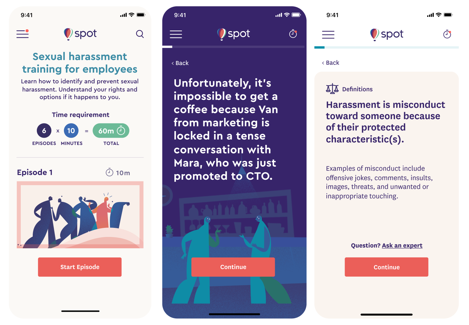
[Fig 1.1]
Three screens from Spot's Sexual Harassment Training - Episode 1 (left to right): Episode catalog, episode scene in dark theme, and legal terms and definitions card.
In 2020, I contributed to the development and launch of Spot's Sexual Harassment Compliance Training Series, ahead of new state laws and deadlines. This initiative expanded Spot's platform from incident reporting to comprehensive compliance training, addressing the challenge of making mandatory training engaging and effective.
The launch of Spot Training significantly boosted revenue and expanded Spot's reach, enabling numerous companies to provide essential compliance training to thousands of employees. By prioritizing user-centered design and effective team collaboration, the project successfully addressed the challenge of engaging users with mandatory training, resulting in a product that not only met legal requirements but also delivered a positive user experience.
Spot is a secure and anonymous AI reporting tool that helps employees report workplace harassment, discrimination, and misconduct through a non-biased third party. Through a chatbot interface, users create detailed incident records for personal use or HR submission. Following submission, Spot facilitates communication between employees and HR via cognitive interviews throughout the resolution process.
[Fig 1.1]
The marketing video that I directed for Spot during my tenure.
In 2019, Spot sought to expand its services by introducing a Sexual Harassment Compliance Training Series, timed to meet impending state legal requirements. The objective was to develop a training program that was accessible, legally compliant, engaging, and structured into digestible segments for busy professionals. The series comprised twelve 10-minute interactive episodes covering critical topics such as discrimination, retaliation, bystander intervention, and supervisory responsibilities.
The primary audience included Spot's current and prospective enterprise clients, encompassing various work environments facing harassment, discrimination, or misconduct, and HR teams responsible for managing these issues. The training series targeted both employees and managers, ensuring compliance with state-level sexual harassment prevention laws across all staff levels.
As Principal Product and Brand Designer, I played a critical role in the development and launch of the 12-part Sexual Harassment Compliance Training Series. This case study highlights a portion of my extensive involvement in Spot's core product design, brand identity development, marketing materials creation, and feature refinement, including the chat experience and enterprise admin dashboard. Throughout my tenure at Spot, I collaborated closely with C-level stakeholders, engineering, and the content team to ensure our product met legal requirements, accessibility standards, and exceeded user expectations.
Let’s be honest—we all hate compliance training. At its worst, management pulls out a dusty VHS and forces the whole team to watch some outdated, cringeworthy video that will drag on for an eternity. Best case scenario, the team is stuck consuming a boring webinar-like presentation that’s equally uninspiring. It’s no wonder most people readily admit that when training starts, they just whack the play button, minimize the browser window, and get back to lunch.
[Fig 1.2]
Kmart Sexual Harassment Training Video [1990's Cringe] Source: Youtube
The product challenge was to develop a compliance training series that met incoming state laws (e.g., California’s SB 1343 and SB 778) while overcoming this engagement barrier. Legal requirements included:
12950.1.
(a) […] The training and education shall also include practical examples aimed at instructing supervisors in the prevention of harassment, discrimination, and retaliation, and shall be presented by trainers or educators with knowledge and expertise in the prevention of harassment, discrimination, and retaliation.
Our team faced three major challenges during this project:
We initiated the project with user research to understand the needs of our enterprise clients and the upcoming legal requirements. Utilizing insights from this research, we identified areas for improvement and workshopped "How Might We" statements to ideate solutions. We then benchmarked familiar social media patterns, such as Instagram "Stories" and Duolingo, to inform our design. This process involved whiteboard sessions, low-fidelity wireframes, and rapid iteration.

[Fig 1.3]
Spot Training whiteboard ideation sketches
Following the initial ideation, our team of copywriters, designers, and engineers collaborated to define a modular structure, enabling an agile process during the two-month sprint. This framework facilitated clear role definitions, expectation setting, content structuring, and delivery cadence for our international team.

[Fig 1.4]
Planning strategy for each episode
Leveraging multiplayer tools like Google Docs and Figma, we enabled seamless collaboration across our globally distributed team, ensuring consistent structure and accessibility for all members.

[Fig 1.5]
An example of how our working templates match up to each screen in an episode. (Dark theme)

[Fig 1.6]
An example of how our working templates match up to each screen in an episode. (Light theme)
We faced the challenge of ensuring users spent the necessary time to meet legal requirements (60 minutes for employees, 120 minutes for managers) without creating a frustrating experience. User research indicated a tendency to rush through online training.

[Fig 1.7]
Episode time break down by employee role.
Initially, we explored a timed CTA button with a loading animation, aiming to control the pace. However, user testing revealed this approach to be irritating.

[Fig 1.8]
Some screens from our timed CTA explorations.
After going back to the drawing board (literally), we landed on a three-part plan:

[Fig 1.9]
Examples of the "gentle timer" interaction, and the unmet time gate.
This approach balanced compliance with user experience, fostering engagement.

[Fig 1.10]
A collage of some of the many hundreds of screen illustrations made for training.
Looking back, I’m incredibly proud of how we navigated many tricky UX challenges. Once we’d solved those, I dove headfirst into the next big piece of the puzzle: illustrating over 400 unique scenes in full brand expression for all 12 training episodes.
To add another layer to the story, this illustration marathon happened from my “soft office”—aka my bed—as I was recovering from a surprise surgery. I definitely believe in the importance of sick days, but also sometimes you just love the work so much that you get it done in the most unexpected places.
It was a wild ride, but seeing the final product, where both the UX and the visuals came together seamlessly, made every hour of co-working with my one-year old "intern" and geriatric chihuahua fun and super memorable.
[Fig 1.10]
A collage of some of the many hundreds of screen illustrations made for training.
[Fig 1.11]
The Spot Sexual Harassment Training prototype for Episode 1: Part 1.
OK, so when we launched Spot Training, we were hoping for a good response, but the actual numbers? They blew us away. We're talking a 740% jump in new revenue and a wild 1,150% increase in recurring monthly revenue. It wasn’t just about the revenue, though. By the end of the following year we’d helped 64 companies—you know, big names like Medium, Stripe, and Kickstarter—get their teams trained up on sexual harassment prevention. That’s over 9,000 employees, and that’s huge. It really hit home that we’d built something that wasn’t just cool, but actually made a difference.

[Fig 1.12]
Metrics for Spot's Sexual Harassment Training, post launch.
Honestly, launching Spot Training felt like a massive accomplishment. We’d all poured our hearts into this, and seeing it actually work? That was something else. It wasn’t just the product itself, but the way we all came together as a team. I walked away from that launch feeling incredibly proud and just deeply grateful for the people on my team.
It was clear that our clients saw the potential in Spot Training, which was awesome, but with all new things it also meant Spot needed to do some restructuring to ensure long term support, I transitioned back to the All Turtles creative bench
It was a bit of a “bittersweet” moment, you know? But, it also meant I got to take all the stuff I’d learned while working on the many facets of Spot—all the UX work, the powerful brand we built, the whole “making something that matters” vibe—and use it on my next projects.
I will forever be Spot's biggest fan and ally, and good friends with all the amazing people that were part of the Spot team for the few years I was in role.
Software Engineer
"Working with Micah has been a dream. From our first collaboration on Spot, I was impressed not just by the beauty of their designs but by how effortlessly they navigated conversations with engineers, content team, illustrators, managers, and stakeholders.
Every screen was thoughtfully crafted to balance aesthetics, functionality, and accessibility. Micah led the project from beginning to end, ensuring every design choice reflected diversity, from the neutrality of the illustrations to the welcoming tone of the text.
Their ability to blend creativity with purpose shaped our project into something more thoughtful, engaging, and accessible to all. Since then, I’ve been continually amazed by Micah’s talent for solving complex visual challenges and pushing creative boundaries. Their work is stunning, thoughtful, and deeply meaningful. I highly recommend working with them."
Micah turned a tough challenge—online harassment training—into a beautifully designed, user-friendly experience, fast"
