[Fig 1.1]
The CommonLit Text Library and Brand Identity before (right) and after (left).
In July 2024, CommonLit brought me on to lead the design and implementation of their first comprehensive Design System. I also drove the user experience refresh of focused areas within their core product, utilizing the newly defined Design System as its foundation.
We successfully launched the CommonLit redesign in October 2024, resulting in a more intuitive and user-friendly experience for educators and administrators. Our efforts successfully transformed CommonLit into a more accessible and efficient tool, evidenced by positive user feedback and high adoption rates.
CommonLit is a web app that provides English Language Arts (ELA) curriculum, test preparation materials, benchmark assessments for educators and school administrators. It is designed to supplement classroom instruction, facilitate an increase in literacy rates, and support educators with on-demand professional development.
My collaboration with the CommonLit Product team encompassed a comprehensive design evolution, including a rebrand and a refresh of the marketing website. However, the focus of this case study is solely on my direct responsibility for designing and implementing a new design system within the core CommonLit platform. The responsibilities relevant to this focus include:
The primary audience for CommonLit is educators in U.S. public schools teaching English Language Arts (ELA) to students in grades 3-12, with a particular emphasis on grades 9-12. The secondary audience includes school administrators seeking a high-level overview of student literacy rates, and ways to provide their teams with professional developement.
I spearheaded the design refresh of CommonLit, combining my product and brand design skills to create a more intuitive and visually cohesive experience. I refined a new brand identity, developed a new design system, tackled complex design challenges, and revitalized key user experiences.
A crucial part of my role was working hand-in-hand with the engineering team to align the design system with Tailwind semantics, ensuring a smooth and efficient build process. I also refined the brand's visual language, expanding its application within the platform, and contributed to the overall product strategy. Essentially, I made sure CommonLit was not only user-friendly and aesthetically pleasing, but also flexible and evergreen.
CommonLit, initially developed by passionate educators, faced significant design and scalability challenges. While the educational content was of high quality, the user interface and overall experience lacked consistency and cohesion. The absence of a centralized design system led to a fragmented user journey, with each new feature requiring isolated design and engineering efforts.

[Fig 1.2]
The previous state of the CommonLit Text Library experience, before the redesign.
This resulted in substantial design debt and hindered the teams ability to scale effectively. Moreover, when I joined the team, the business was in the middle of a rebranding effort. The extra layer of complexity required a bit of juggling because we had to strategize how to integrate and expand on a partially complete visual identity as we built the new design system. The age old "build the plane as we fly."
The redesign of the CommonLit platform needed to be mindful of several key constraints which shaped the project's scope and approach. Limitations included:
We kicked off by establishing the fundamental building blocks: color and typography. This involved not just picking pretty hues and fonts, but aligning with stakeholder vision and the evolving brand. After refining the brand palette, I created a flexible color system. For typography, we introduced new editorial typefaces while ensuring scalability across devices by meticulously mapping styles to Tailwind CSS. This close collaboration with engineering from the start was key to a smooth build.

[Fig 1.3]
The CommonLit color palette before my design effort (left) and part of the extended brand color palette from the CommonLit Design System (right).

[Fig 1.4]
An overview of typography styles defined in the new CommonLit Design System.
From the outset, ensuring the design system met accessibility standards was paramount. While accessibility was a continuous consideration, we rigorously validated color contrast and typography size. By systematically testing color pairings and establishing clear guidelines, we ensured the foundation of our design would be usable by a wide range of individuals.

[Fig 1.5]
An overview of the accessibility study of color contrast and type size for the new CommonLit Design System.
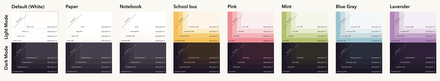
[Fig 1.6]
A look at the elevation study for surfaces in light and dark mode created while defining the new CommonLit Design System.
Anticipating the need for user customization and accessibility, I proactively built light and dark themes into the design system using Figma variables. This forward-thinking approach provides a robust framework for future enhancements, ensuring the platform can adapt to diverse user preferences.

[Fig 1.7]
A screen capture of the Figma Variables overlay exemplifying my use of primitives and tokens to accommodate light and dark modes to future proof the CommonLit Design System.
The existing horizontal dropdown navigation was clunky and inefficient. Our goal was to create a more intuitive way for teachers and administrators to navigate. I spearheaded a redesign to a persistent left-hand navigation, requiring a complete overhaul of the information architecture. This exposed all key subpages, reducing clicks and cognitive load. This structural shift was particularly beneficial for screen reader users, providing a clearer and more accessible navigation experience.

[Fig 1.8]
Reimagined left side navigation components from the CommonLit Design System in light and dark mode variants set up by Figma variables.
Beyond the navigation structure, we refined the underlying information architecture to improve wayfinding. We established a clear hierarchy, utilizing L1 pages with persistent navigation and L2 pages as overlays. This visual cue helped users understand their context within the platform, reducing confusion and improving overall orientation.
[Fig 1.9]
Examples of elevations as part of the IA overhaul which included rethinking the navigation, and utilizing overlays to improve the users sense of place.
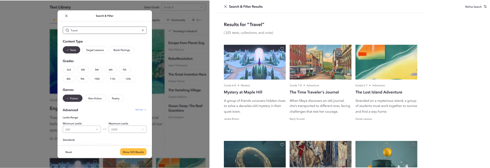
The Text Library suffered from various usability issues. Our goal was to create a more seamless and visually appealing experience for accessing and reading content. Leveraging the established typography system and implementing constraints for image handling, we addressed issues like cropping and truncation. This led to a more consistent and user-friendly core experience.

[Fig 1.10]
A side-by-side comparison of the before (left) and after (right) state of the CommonLit Text Library experience.
Throughout the entire process, every design decision, from color palettes to navigation patterns and Text Library improvements, was integrated into our evolving design system. We meticulously documented primitives and components, and patterns ensuring clarity for both the engineering team during implementation and for future design iterations. This focus on documentation was crucial for long-term scalability and maintainability.
[Fig 1.11]
An example of a component: Buttons by state and type in the CommonLit Design System.

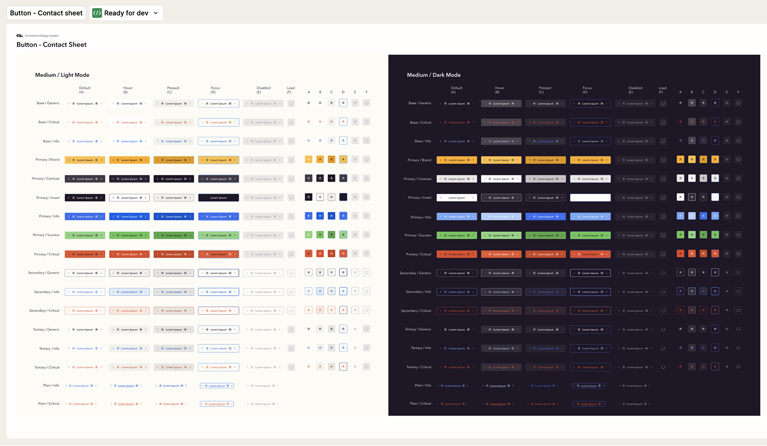
[Fig 1.12]
An example of the extensive documentation of the Button component in the new CommonLit Design System.
Following three months of intensive design and development, CommonLit 2.0 was successfully launched in October 2024. To ensure a smooth transition for users, we implemented a comprehensive onboarding experience, showcasing the redesigned dashboard, navigation, and updated brand identity. This onboarding process, featuring a refreshed character design and a new voice and tone, was met with overwhelmingly positive feedback from teachers.

[Fig 1.13]
The Text Library presented in responsive scaling including desktop, tablet and mobile screens.
Within weeks of launch, over 89% (over 20,000 users) completing the onboarding tour. Another key metric was an almost empty support inbox, demonstrating the update was intuitive and user-friendly. This high adoption rate underscores the effectiveness of the redesigned dashboard and navigation, which were central to the project's objectives.

[Fig 1.14]
A screenshot from post-launch feedback from a member of the Customer Success team.
Just kidding, the support inbox wasn't completely empty. Actually, the messages we received came from teachers reporting significant improvements in their ability to navigate the platform and access essential resources. One teacher, in particular, noted the platform's seamless integration with Google Classroom and the effectiveness of its standards-based assessments, attributing improved student scores to CommonLit's resources. The teacher also highlighted the platform's user-friendly tutorial and the heartfelt message of appreciation for educators, emphasizing the platform's positive impact on their teaching experience.

[Fig 1.15]
A screenshot from post-launch feedback from another member of the Customer Success team.
These qualitative and quantitative results demonstrate the project's success in addressing the identified challenges and constraints. By implementing a robust design system, refining the user interface, and enhancing the overall user experience, we transformed CommonLit into a more accessible, efficient, and user-friendly platform for educators and administrators.
Micah is an exceptional principal product designer and genuine player-coach.
I had the privilege of collaborating with Micah at CommonLit, where they drove the end-to-end product design for our new design system and component library. Micah was attentive to detail, speedy, and thorough in their work. The quality of their work was stellar—everything from crafting components, to writing annotations, to creating informative handoff videos and collaborating with engineers.
In addition to being a great designer, Micah is also a great team player. Micah took the time to kindly coach and integrate our more junior team members, who appreciated all that they learned from Micah directly and indirectly. Micah also stepped in to help lead our team while I was away for an extended medical leave, and we couldn’t have launched our design system or redesign without them.
I highly recommend Micah for any expert level product design roles or engagements.
I worked with Micah at CommonLit where they were brought on as a Principal Product Designer and quickly became an essential part of the design team. Bringing on Micah was easily the best decision we made.
They are a rare gem as a designer—laser-focused, quick, effective, and an overall wonderful human being. They created and implemented the design system, introduced and refined new branding, overhauled both the product and the marketing site, all while managing stakeholder expectations and coaching our junior teammates.
We collaborated on a daily basis as a design team and worked in lock-step with our engineering and product management partners. We received resounding positive feedback about Micah’s inputs and expertise. Simply put, they were a joy to work with. I would recommend Micah to anyone looking to add a brilliant designer to their team.
